

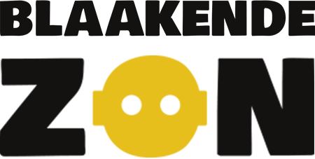


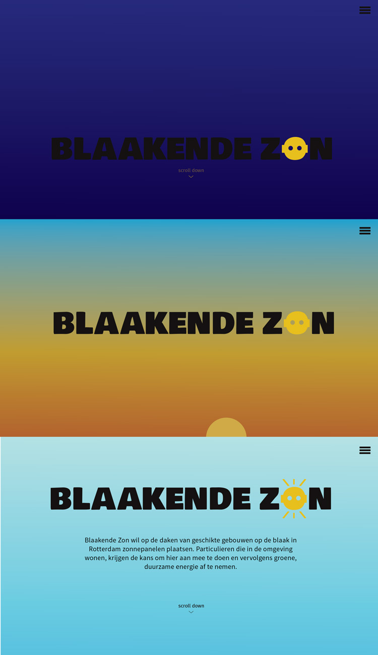
Blaakende Zon is a company that wants to provide green energy to the people of Rotterdam. The bright colors, the little dwrawings and the illustrations make the design playful and therefore not too serious. By using a 'grungy' background in some parts of the design, I tried to give it a bit of an old-paper feel, to make it look more eco-friendly.
View sketches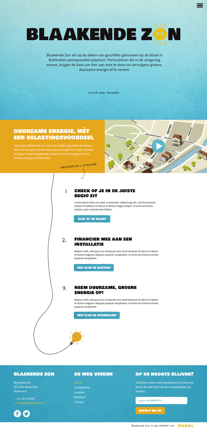
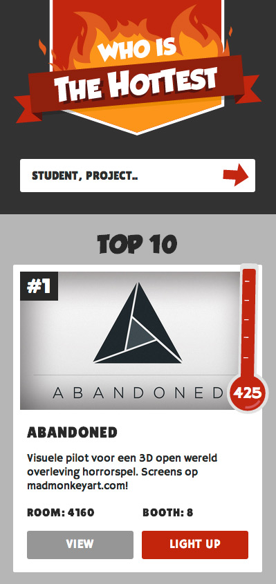
Who's hottest is my final school project. It is a mobile-first voting site, which allowed the students and visitors at the final exposition to vote for the best project, which did not not only lead to an interesting competition, but also made it easier for visitors to find their way to the best projects.
Since I needed the other students to fill in their information and participate in my project, it needed to have a playful, fun look, which is why I decided to use illustrations and bright, outstanding colors.
View sketches View website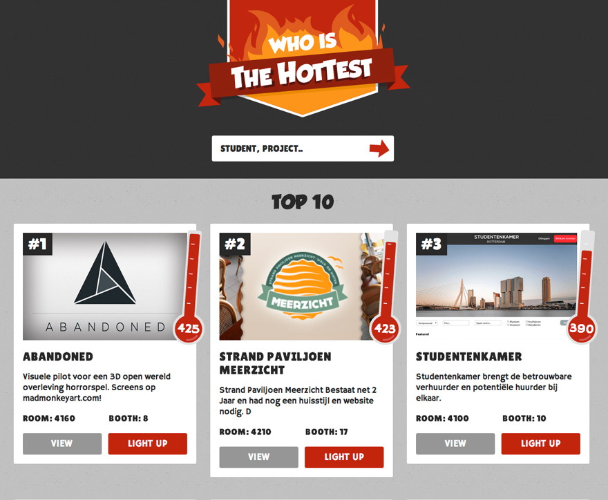
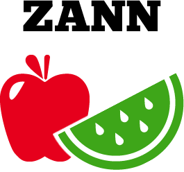
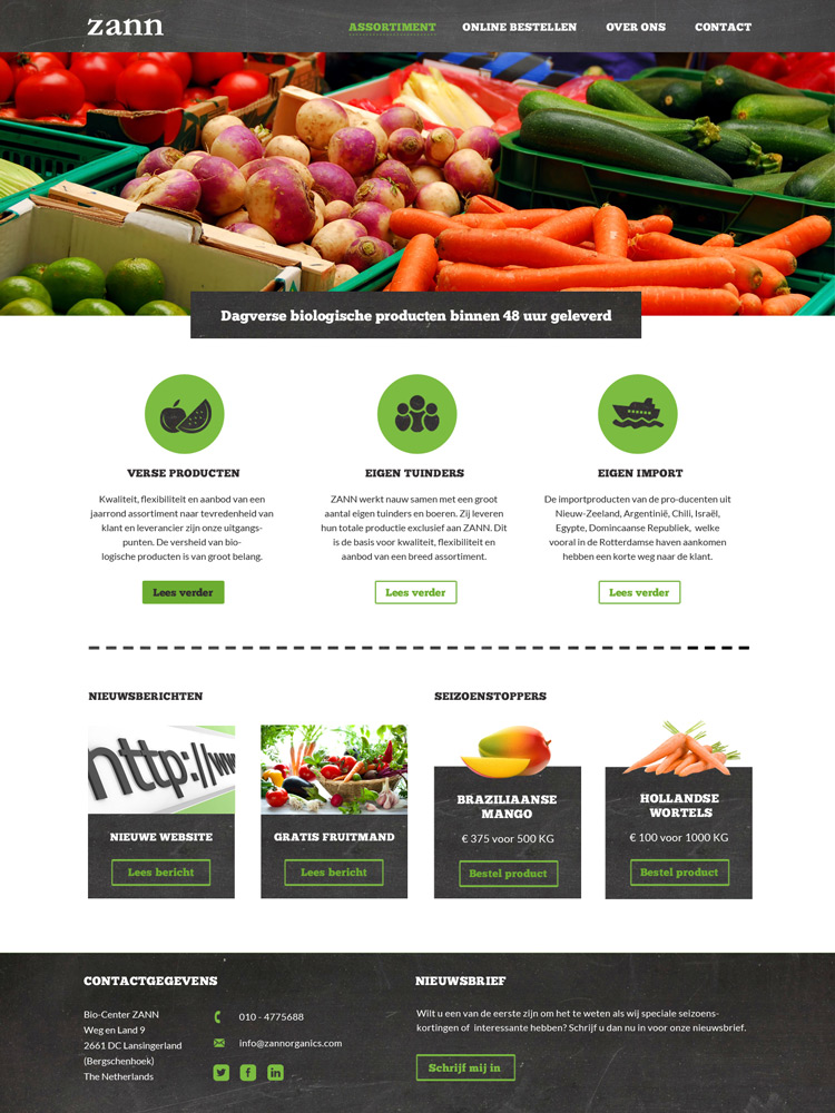
Zann is a company that sells biological fruits and vegetables. I tried to give it a biological look and feeling by using the color green and also implementing a chalkboard in different parts in the design.
Natuurlijk aan 't spui is a restaurant that serves biological food. Since it is a very cosy and friendly place, that is also what I wanted the logo to feel like. Therefore I decided to use fonts that I found the be friendly because of their 'roundness', and I used friendly looking illustrations as well.
I chose to use the colors brown and green because those are the colors you find in nature, which suits a biological restaurant.
View sketches


Slimme Koop is a company that sells different pet-related items online. They want to represent themselves as a friendly, young company, and they needed a flyer that would represent that as well. I tried to give the flyer a bit of a 'farmer-feel' by using the wood and the cut-outs. Besides that I used a lot of images of pets to make it very clear what Slimme Koop does.
View sketches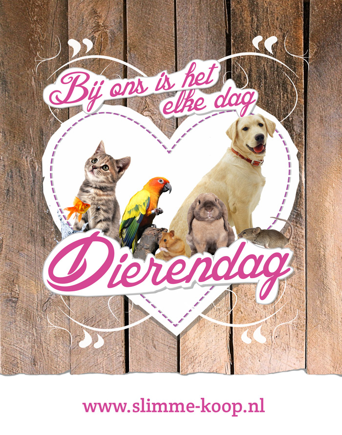
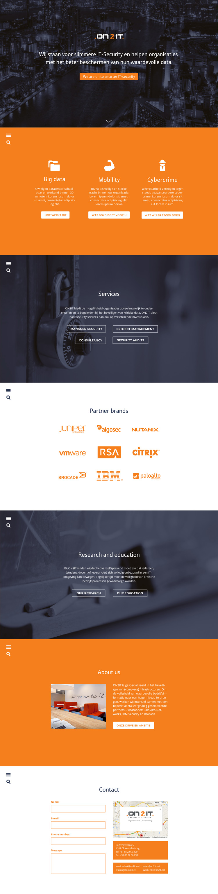
On2it is a company that works in IT-security. They needed to put a lot of (sometimes very technical) information in their website, but they still wanted keep it understandable and simple. Because of this I decided to make the website a 'one-pager'. This allows the user to scroll trough different sections of simple, short information, and if he wants to know more about some specific information he can read more there.
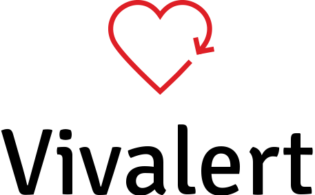
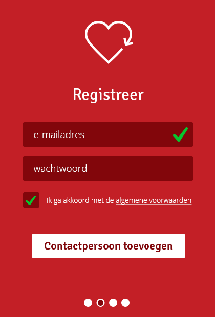
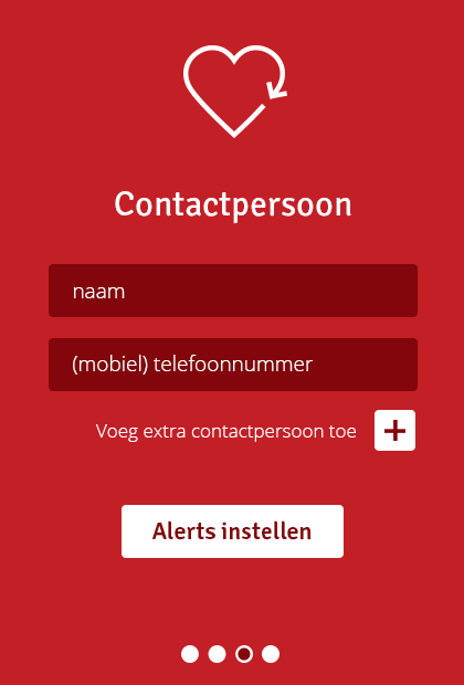
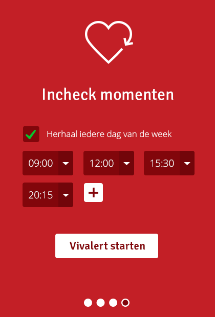
Vivalert is a mobile app that allows people with health problems to 'check in' at a daily basis, to let the people around them know that they are still well. Since mostly older people are going to use this application, I tried to keep it all as simple as possible and I did not add any unnecessary things. I used the colors red and white, to give it a medical feeling.
View sketches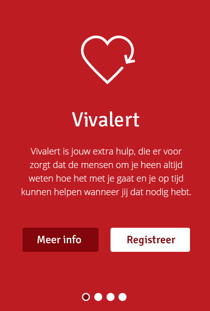
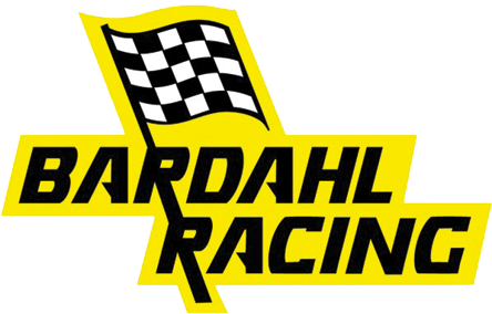
Bardahl is a company that has been selling products for racing cars for 75 years. They still have a lot of footage from races back then, with race cars that have their logo on them. I thought those movies were amazing and it would be very cool to use them as a full-screen intro when you enter the site.
View sketches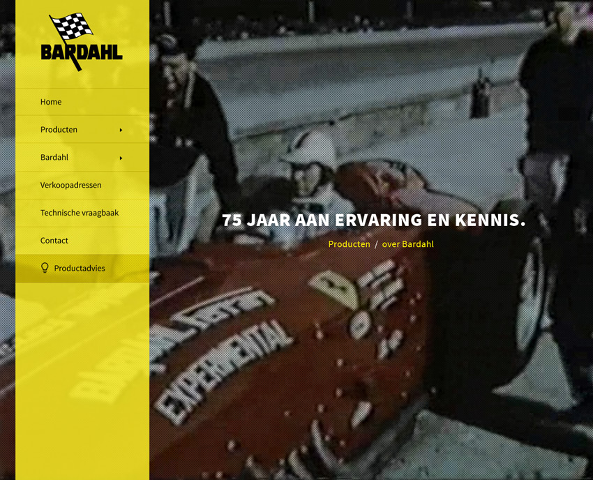
Since this is my portfolio I wanted to give it a style that I feel represents me. I used bright, outstanding colors to make it playful and happy, but at the same time I kept it all very clear structured and simple. It wanted it to tell a small, clear story about what it is that I do and what you are looking at, and then just focus on my work.
View sketches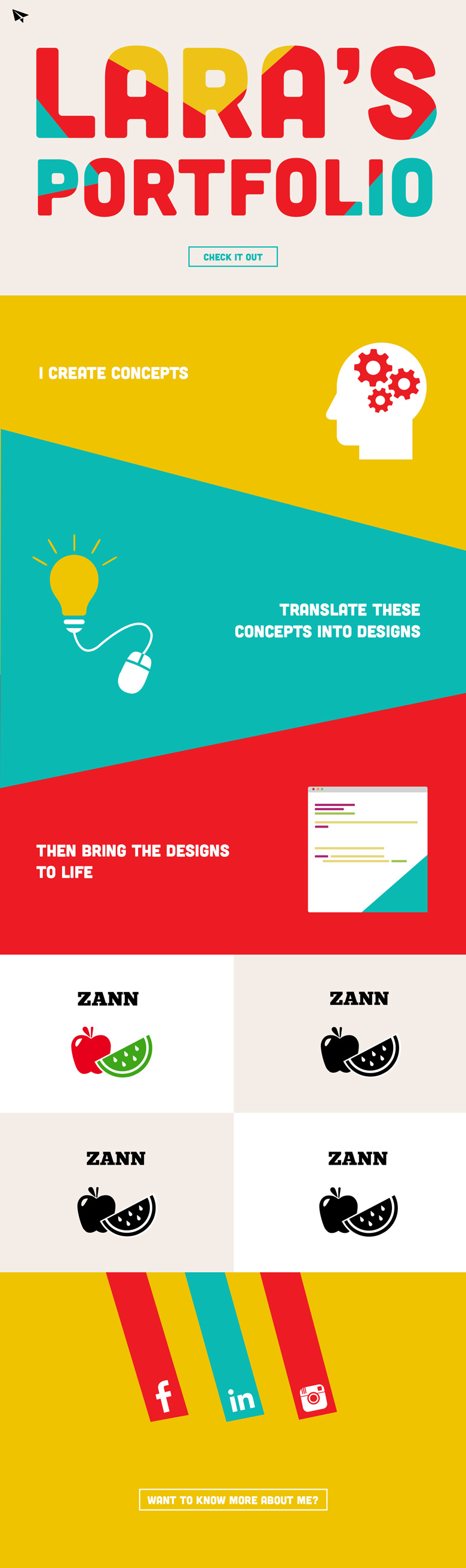
My name is Lara, I'm a 20 year old student and webdesigner/front-end developer from Oud-Beijerland, a small town in the Netherlands. When I'm not behind my computer or sketchbook, I love to watch movies, read some exciting thrillers and travel as much as possible.


